This weekend, I finally cranked out some new gallery code (for the control panel, not for the front-end). With all the pictures I've been taking lately, managing the old gallery was far too cumbersome.
The problem was that I had written a level of abstraction in the CP which was geared towards helping me write less code - basically I extend a simple Item class to describe any item in Tabulas, for which there are many: links, entries, autolinks, icons, files, content files, templates, stylesheets, backups, etc. After I write the methods for interacting with these objects, I have a generic Items class which does all the legwork in defining the UI flow for adding/editing/deleting these items. This is why there's so much consistency between the views (check out how similar autolinks/icons are). And this does work, but like all generic things, it only does an average job and not an exceptional one.
When you're maintaining a large code base as a sole developer, this type of low overhead is necessary - it leaves me to spend my time taking foolish Christmas photos and baking cookies.
Anyways, the problem with this approach that while it was consistent, it wasn't very contextually relevant. Anybody who's used Tabulas' gallery in the past few months can tell you that the level of differentiation in albums/images was annoying. (Actually, had I not added the "Your gallery" option to the journal entry page, I probably would have stopped using the gallery a long time ago).
To modify albums, you had to go to the "albums" section, while modifying images had to be done in the "images" section. Not only that, but editing could only be done one item at a time. How annoying is that when you're trying to annotate a 24-image album that you just uploaded? Fail.
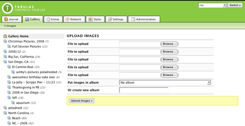
The ideal UI would merge the two concepts into a single, unified view. Or at least one which provides a unified navigation. So here is what I'm trying now:

Your full album list is on the left side. Everything (Although this may change - in my case, I have like 50 albums, so this gets real cumbersome real fast). Clicking any of the albums takes you to the list of images on that page, which you can immediately edit:

One problem that I had with views like this in the past was deleting - it was always so hard to do mass deletions when you weren't using a grid layout view. Fortunately, Facebook solved this problem for me, by adding a checkbox to each image for "deleting." I don't think it's intuitive at all, but it is pretty easy to use once you figure it out (maybe it's just a discoverability issue, then) and it cuts down on the code I have to write, so whatever.
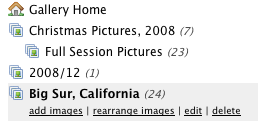
So if the album target loads up the images, how do you edit the album itself? On the left side, underneath the album name:

Pretty self-explanatory.
The downside of this implementation is that it renders the "Gallery" tab kind of useless - it's just this one item, and gallery is too important to not have a tab. It's also not consistent with the rest of the UI (but that may not be a bad thing - maybe context is more important here).
I'm much happier with this implementation for now; we'll see how well it continues to work.
. . .
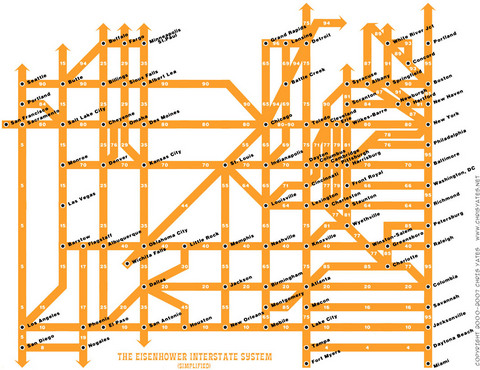
This is unrelated, and I'm not sure if I've posted this before, but this is a "simplified" view of the US Interstate Highway system; it's designed like those subway maps.
I don't know why, but I think it's just the coolest thing ever:

I wonder if they make this in a poster - that'd be really cool.
Edit: Well, that was quick. I found it with some quick Googling - $12 for a 16" x 20" print? I'm in! (This also led me to a really cool blog - Strange Maps. Added to my daily reading!

