Entries for June, 2007

When I was reorganizing my portfolio at the beginning of the year, I was looking to maintain some international exposure. I wanted to have Chinese exposure as well as European exposure. For Chinese exposure, I ended up buying the FXI (which is the only holding which is treading water thus far in my IRA). For European exposure, I was thinking either FECAX (Fidelity's European fund) or IEV (the European iShares ETF). Since buying FECAX is free, I figured that was the smart move.

Six months later, what do I have to say? Bzzzt, another idiot move. Who knew there could be such a divergence between "actively" managed and "lazily" managed funds? Somebody smart is getting paid to manage FECAX, and he can't beat the lazy IEV fund (theoretically they should both perform about the same). +5% for the year vs. +15%? This doesn't even taken into account the $2 divvy IEV paid at the end of the year ... shucks.

So anyways, the lesson I've learned: Don't buy Fidelity mutual funds. See if there's an ETF which is supposed to do the same thing: even saving that 1% expense ratio on those mutual funds can go a looonnng way.

(Of course, there are cases when Fidelity's funds perform about the same as other ETFs, but those don't seem to do that much better... I mean, FICDX is a 5 star mutual fund! And it performs the same as an ETF! Come ON!)

Disclosure: I suck at stock picking, so you're probably better off doing the opposite of what I say. I owned positions in FECAX until three days ago, when I opened a position in IEV instead. I own positions in FXI as well. Jeez, isn't that obvious? Aren't disclosures fun?

Update: Steph points out that the the graphs are a bit deceptive because they don't account for the distributions. Very true. Here is an updated image which shows the 3 month gains for IEV vs. FECAX. The caveat here is that 3 months is really not a long enough time to show the gains made ... oh wells:

If I weren't so lazy, I'd do the actual math on the gains for one-year, including distributions (IEV had a small ~$2 distribution at the end of last year, similar to FECAX) ... but the 3 month is sufficient enough to justify to myself that the 1.09% expense ratio for FECAX isn't worth it (IEV has an expense ratio of 0.60% according to the prospectus).

Posted by roy on June 1, 2007 at 08:19 PM in Finances | 6 Comments

Besides my annual bouts with bronchitis and my annual "i can't sleep plz give me ambien" visits, I haven't had a real legitimate reason to visit the doctor my whole life. This streak came to an end today. To satisfy your curiosity, I'm fine.

Anyways, the checkup went pretty normal; the doctor turned it into a physical halfway through. I don't know why or how, but my sexual orientation was questioned. When I said I was straight the doctor gave me this "Yeah, right" look. Why do I feel like my sexual orientation is always in question?????? Be it friends, coworkers... now doctors. Sighmuffins.

Anyways, I was able to pee on command, so I was pretty pumped about that. I was feeling pretty victorious about my little cup of pee (I had actually peed before I left for the doctor, so this was an epic feat of kidney and bladder control), when the doctor told me to go down to the end of the hallway to fill out some "paperwork."

I figure it's some crap since I'm a new patient, so I sit down and wait patiently.

A guy in a big white labcoat calls me into the room (warning?). I sit down. I begin to wonder why there's no files or file cabinets in this room. I sit down in this big gray chair. The guy in the big white labcoat spins around in his chair and puts on some latex gloves (with the little satisfying "snap").

Wait a frickin' second. I look to my right. Vials. Of blood. The lab tech folds down the arm of the chair. He grabs an elastic rubber band.

WAIT A FRICKIN' SECOND. THIS ISN'T A PAPERWORK ROOM. IT'S A BLOOD ROOM. FRICKIN VAMPIRES!!!!!

Let me preface this by saying I absolutely hate needles. See the bolded text? Wait, I can express my hatred more semantically in HTML: I hate needles.

The last (only) time I've had a needle stuck in me was in high school, when I was giving a physical for track. By my calculations, that was 9 years ago. I've avoided getting a physical since then; not only cause I'm in tip-top sexy physical shape, but because I hate needles (and the ball grabbing + coughing thing, that really sucks).

For the record, I don't pass out or whine or cry or get super light-headed or anything ... the before and after are more what bugs me. For example, I'm sitting here, sitting gingerly, because I'm afraid of I extend my arm, my arm will start spouting blood like the fountains in front of Bellagio. And when I see too much blood, I may pass out.

Anyways, those bastards stole some of my blood. They TRICKED me!!!!

The upside... two weeks from now I get to find out there's absolutely nothing wrong with me (I hope).

Posted by roy on June 4, 2007 at 04:02 PM in Ramblings | 8 Comments

Prologue: We've had tape marks ALL over our whiteboards from when we moved 5 months ago. I had some Goo Gone (THAT STUFF IS FRICKIN' AMAZING, I KID YOU NOT!) so I finally brought it in today to clean the white boards. This conversation ensued:

Steve: That stuff is amazing! Where did you get it?
Me: Bed, Bath and Beyond.
Me: Uhh wait. I mean, Target. No, I mean, Wal-Mart.

Aaron busts out laughing.

True story.

Posted by roy on June 6, 2007 at 11:57 AM in Foolishness | Add a comment

i'm onto the little tricks at my doctor's office. they called me rather urgently (the nurse who called definitely had a sense of now-now-now) asking me to come back to the office for additional blood work. the nurse made some excuse about seeing "way excessive potassium" in my blood ... but i was pretty sure they had actually discovered that my blood indicated some sort of genetic mutation which would allow me to scale walls ... or maybe my bones were secretly made of a new indestructable metal ... called adamantium...

just kidding.

seriously though, they did call about excessive potassium. and the nurse did sound rather alarmed. so i walked over to the office where they took more blood. what sort of sucked was while i was there, the nurse was whispering to the lab tech. if there's one thing you don't want to see, it's a nurse whispering to a lab tech while you're sitting 3 feet away. you also don't want to hear her say, "the doctors says he needs these results STAT."

of course, curiosity started getting the better of me, so i came back to the office and googled "high potassium." dear lord.

Of course, wikipedia has an entry on it. reading that thing is pretty scary, especially if i went to the doctor's in the first place because of i was having trouble breathing over the past week (please, save the "you're too stupid to remember to breathe" jokes).

man, i was STRESSED for those two hours while i was waiting for test results. it's not so much the sickness that bugged me, but the fact that i wasn't feeling so invincible anymore. i'm in my physical prime right now, how crappy would it be to get something like "high potassium?"

anyways, the nurse called me up later and said my second test came out normal. phew. maybe i'll go jump off a few buildings now, i feel so healthy...

Posted by roy on June 7, 2007 at 09:04 PM in Ramblings | 7 Comments

that last post is depressing, so i need a new one just to take its place. if i were to die in a freak car accident, i wouldn't want that post to be my last post. instead, i will post this picture from icanhascheezburger.com:

Posted by roy on June 11, 2007 at 02:25 PM in Ramblings | Add a comment

Apple released Safari for PCs. Holy crap. I mean, on one hand, I'm not looking forward to having to debug a 5th browser (Firefox, Opera, IE6, IE7 being the 4 others), but on the other hand, I can finally debug Safari issues without having to lug around a Mac.

The more important thing is that Apple is allowing application development for the iPhone using Safari. Details seem kind of scarce right now (I'm sure that'll be ironed out), but I'm just blown away by how "right" this feels. All this talk of Adobe AIR, Microsoft Silverlight, etc. etc.... they're missing the boat. HTML, Javascript, and CSS feels clunky and is a software engineer's worst nightmare, but it works. It's been vetted for the past [insert-any-number-between-1-to-10] years, and we're continuing to see greater adoption cause it's easy, fast, and doesn't require any additional installs (besides the browser, obv).

Posted by roy on June 11, 2007 at 10:57 PM in Web Development | 7 Comments

Doesn't look like Safari renders pages the same on PC as a Mac:
(Images lifted from a blog post and stored on my tabby for archival reasons)

Ruck ro.

. . .

There's been so many blog posts about the font rendering in Safari.

Joel says:

  • Apple generally believes that the goal of the algorithm should be to preserve the design of the typeface as much as possible, even at the cost of a little bit of blurriness.
  • Microsoft generally believes that the shape of each letter should be hammered into pixel boundaries to prevent blur and improve readability, even at the cost of not being true to the typeface.

If this is the case, I have to disagree with Microsoft's approach to font rendering.

Dave Shea says:

And that’s the difference here. ClearType is a closer match to what I do manually already. Yes, I prefer the way type on OS X looks; ClearType seems too sharp and overly blocky, the subtleties of the curves are lost and it’s overly chunky. But, for the medium in which it’s being rendered, it seems like a more ideal solution.

To me, that could be boiled down to: "I like ClearType cause it does what I do."

But what about for font designers who don't respect the pixel grid? How does that render in ClearType? It seems, if anything, respecting the pixel grid is boxing in font designers to programmatic restrictions. I find that limiting designers to the constraints of a technical systems always lead to some hair-pullling (designers are a finicky bunch).

That "I know better than you" mentality is quite dangerous. Even worse so when that "I" becomes a computer algorithm. (Caveat: I've been struggling with this exact issue trying to figure out how we're going to handle user templating; I can force designers to follow a specific paradigm, or I can give them all the tools to hang themselves)

In any case, I'm not using Safari. I loaded it a few times, didn't find it particularly faster, and I'm not a huge fan of that Apple chrome. The security issues, the lack of consistent rendering ... looks like I'm sticking with FireFox for the time being.

I don't use IE7 regularly because every few weeks I need to switch my IE browser to IE6 for testing purposes for our product. I tried downloading the VM image or IE6 (which does work), but I'm already running our wiki inside a VM on my PC and for some reason that wouldn't play nice with the IE6 VM image from MS.

Posted by roy on June 13, 2007 at 10:38 AM in Web Development | 3 Comments

URL encoding/decoding = worst thing EVER.

What's worse is that every stack thinks it's somehow responsible for decoding. For example, try's say you're trying to access this URI:

/F%20

Firefox will decode that if you put into your address bar to "/F " (a space). So when you construct the URL, you need to do an extra urlencode:

<a href="/F%2520">

Unfortunately, if this request is getting passed through to Apache's mod_rewrite or mod_proxy, it will do a urldecode on it. So by the time you get it in PHP, you'll actually get "F " instead of "F%20".

My advice to anybody who is thinking of creating a CMS:

  • Deal with internationalization early on. Most languages/frameworks do this for free, but most PHP apps have pretty shitty internationalization support due to the fact that mySQL and PHP only added really solid internationalization support recently. UTF-8 is your friend (UTF-16 if you want to get real fancy). Know that mySQL stores in latin1 by default; MAKE SURE YOU SET THIS UP CORRECTLY FROM THE GET-GO!
  • Deal with how you're going to store data from the get-go, taking into account special characters. You'd be surprised how much MediaWiki converts page titles (it's not even consistent urlencoding/decoding; it's this halfway encoding/decoding based on certain special characters, prob due to the very limitations I listed above). My suggestion: always store what the user sends you. No magic. No encoding. No special string magic. Just store it.
  • If you have multiple stacks, figure out how you're going to transport data between the stacks. JSON? Through GET? Through POST? Write test cases that check for non-latin1 encoded characters AND urlencoded characters (or strings that look urlencoded but really aren't). Having to go back and deal with those types of issues on existing systems will be your worst nightmare

The biggest annoyance for me is when a seemingly dumb stack does something smart, like mod_proxy or mod_rewrite. All I want it to do is receive the request, then send it over to this script. I don't want you to do magic parsing on the string! Argh!!!!

Because of this, we have to double encode titles when we know they're going to be passed through mod_proxy.

And then we gotta replicate that logic in C#, PHP, and Javascript.

*head explodes*

Posted by roy on June 14, 2007 at 12:06 PM in Web Development | 3 Comments

I've never been very good as swallowing pills - I've had this gag reflect thing for as long as I can remember. (This also affected me during my early drinking days when drinking beer, as I couldn't just guzzle drinks).

Anyways, if anybody else has trouble swallowing pills, I've learned this neat trick: when you have the drink and pill in your mouth, point your head down; the pill will float to the top, close to the back of your throat. I find this much easier than the tilting your head back.

Posted by roy on June 15, 2007 at 02:07 PM in Ramblings | 9 Comments

Note: This rant below was a part of my incoherent ramblings from late last night. I've since friends-only-ed the original post and posted this separately.

Widgets piss me off like nothing else. The reason I *love* RSS readers is cause I don't have to visit individual sites and wait minutes for the page to finish loading it all its widgets. Case in point: I needed to do a quick calculation on my Mac tower, so I hit F12 to load the Dashboard. Fuck me if it didn't take 30 seconds to load up the friggin' calculator ... cause it was loading all the other shit too (weather, and clock, and all that stuff).

Websites are even worse about this. They just blindly start putting crap up and down the right bars, until the page doesn't load. It almost makes me want to surf the web with Javascript off! Buggers!

See, here's the dirty underbelly of this whole Web 2.0 thing: Working across platforms is great, until it goes down. If one of your ten widgets on your page goes down, your whole page will stop working (unless you've engineering that into the initial implementation, which most of you haven't). If the server is slow, your whole page will be slow. That's just the way it is. It sucks.

Point number 2: Writing a Facebook application is absolutely useless for you, cause when it takes off ... your server will go down in flames. And you'll realize you have to fork over thousands of dollars to keep your site running. The Internet used be for hobbyists ... not anymore. (Not that this is necessarily a bad thing - I think the romanticism of amateurism is a bit silly)

The Internet is just starting to come into its adolescence - that's what the second bubble is about (the first bubble was when the Internet, as a young child, was subjected to every possible extracurricular activity by its overly hopeful parents; now, its the experimental but rebellious/revolutionary phase). The problem now is ... the barriers for entry are getting significantly higher.

Safari got a million downloads for their beta. A MILLION. We're reaching the point where stuff like this is not uncommon. Any new service that launches is going to have to scale from the get-go.

I think I had one more point to make, but I should really get to sleep. I do feel my eyes getting tired ... thank god this worked. Journal = therapeutic.

Edit: I remember the last point I wanted to make. Google's done an exception job with integrating their products - the way they integrate is how we should strive to do it across different sites. However, Google gets a big leg-up in this because all their stuff is internal - if Gmail is slow, they can deal with it internally. The reason why Google is succeeding so well on sites like Gmail, Gtalk, and iGoogle (which is, as far as I'm concerned, the best "personalized" homepage product on the web) is because when they do the integrations, it is fast. I think too many sites are feature/product driven ("We do _____ too!") without thinking about performance.

Friendster failed cause their servers died too often. When people start getting sick of widgets and embedded content mucking their productivity, they'll ditch the product. Even if it's not the product's fault.

But one day, I hope we get the level of integration Google achieved with iGoogle. It is a really cool picture of the web...

Posted by roy on June 18, 2007 at 01:12 PM in Web Development | 2 Comments

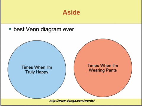
I was reading a Livejournal presentationree by Brad, when this slide came up:

I was immediately struck with this moment of clarity. How true this slide!

If it were socially acceptable, I wouldn't wear pants. I loooovee chilling at my loft with no pants on. Yeah, something to think about for all you single ladies out there... har har har

Posted by roy on June 19, 2007 at 02:20 PM in Ramblings | Add a comment


seven months of no haircut = me 

i had dinner with tim a few weeks back, and he remarked how long my hair was getting. i realized i hadn't gotten my haircut yet in san diego (and obv i can't remember the date when i got my hair last cut in chapel hill), so it had been about six months (ish). i didn't think much of the fact that i only get my haircut twice a year-ish, but tim gave me this weird look.

according to him, it's pretty normal for guys to get a hair cut once a month (for guys who keep their hair short). i don't think i can remember a time when i would get a haircut so often. is it that common for guys to get a haircut that often?!

in the past, i've always just shaved my hair off completely, cause that lets me maximize the time between haircuts. i guess that explains why i don't get my ears lowered every month.

my parents and sister are coming to visit next week (yay!). i'm going to need to get my hair cut before my mom arrives cause she will _not_stop_giving_me_grief_over_my_long_hair. the last time my dad saw me, he joked that i should start wearing my hair in a ponytail like those old samurai guys. i though that'd be pretty badass, but my sister interjected with this "EW THAT'S NASTY"-type comment ...  

Posted by roy on June 20, 2007 at 01:27 AM in Ramblings | 15 Comments

So yesterday at work, everybody was requested to come in early today at work (815 AM, can you believe it?!) because some important people were coming, and they didn't want the office to look empty.

Now, our dev team doesn't really get it kicking until 1030am usually; Max and I battle every day to see who can come the latest; one of us shows up at 1015, the other at 1030.

We got a little grief from Ken yesterday about the engineering team always coming in so late, and Brigette and Steve seemed to indicate that this was not unusual practice at Microsoft (starting late).

Is starting late a cultural thing among software engineers cause we can we get away with it, or is it one of those things where it really does lead to a more productive workday? I used to think I couldn't code when I'm tired (more mistakes), but my work is usually so shoddy anyways I can't tell the difference anymore.

What's the experience at other companies and other professions?

Posted by roy on June 21, 2007 at 09:29 AM in Web Development | 11 Comments

So... umm... ok so I really thought today was Wednesday. Seriously. I was checking on my bank account to make sure some deposits I made earlier this week went in alright (and also cause I gotta figure out how much I can pull out for my weekly gambl..err... charity donation), and I noticed it had a significantly more money than I expected. I look, and there's my payroll deposit. I think it's odd, cause they usually deposit that on a Thursday night rather than a Wednesday night.

I look at it, and it says: ACH CREDIT MINDTOUCH INC PAYROLL ON 06/22. I double click the clock on the bottom right (INSTEAD OF LOADING SOME STUPID WIDGET PAGE THAT TAKES ME 30 SECONDS) and ... wha? It's Friday???

This is probably the best gift ever. Tomorrow is the last day of the workweek!!!

I totally feel like Dwight from that one episode of the office, except he thought it was one day faster than it really was :)

The weirdest thing about this whole experience is I'm looking back, and the whole context of the day seems different. I thought it was really odd my co-worker was taking two days off to go to Vegas, and that our group administrator said "Have a good weekend" as she was leaving (she doesn't work Fridays, but I thought it was a Wednesday, which was odd).

Man, so many little clues! I gotta get my head unstuck from my ass.

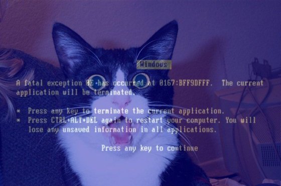
Man, I really feel like this guy:

Posted by roy on June 22, 2007 at 12:04 AM in Ramblings | 3 Comments

(I'm using the new Tabulas entry composer to create this - give it a try when you can!)

The weakest point in MindTouch's DekiWiki is its linking abilities. When I first started using MediaWiki, I marveled at how easy it was to create links. In MediaWiki, you just do this: [[Page To Link To]] which creates: <a xhref="/Page_To_Link_To">Page To Link To</a>.

The simplicity is mind-boggling. You don't even have to worry about linking to a real page - if you link to an important word in MediaWiki and the page doesn't exist, the styling will be distinct, and it will appear as a "Wanted Page."

Unfortunately, when we redesigned the original link dialog, I think it was slightly over-engineered - we tried to model our system against popular systems instead of considering our use cases. The current link dialog looks like this:


Hellloooooo Windows XP!

Here are the problems with this design, as I see it:

  • The most important element (the link input box) is at the bottom, and lacks any type of visual emphasis. This creates an experience where a new user will load up the link dialog, get confused, and leave never to link again (and that defeats the purpose of a wiki, doesn't it?)
    • The reason why this design was implemented was because it reflected the Windows modal dialogs (a stupid idea in retrospect), and because DekiWiki was originally aimed at enterprise usage - in that setting, you can assume there's some "gatekeeper" who is maintaining the hierarchy. If the hierarchy structure is kept consistent, you can assume that users want to discover pages through hierarchy ... unfortunately this metaphor breaks down for large datasets or community-driven wikis.
  • Navigation of a wiki via hierarchy isn't as useful as you would think
    • Let's think about this for a moment. When I click that "Create link" button after I've selected text in my editor, I either know where I want to link to, or I want to discover where this page exists. Having to navigate a hierarchy to get to the page you think you want to get to is ridiculous (imagine having to click 5 or 6 times to create a link ... how often would you link?
  • Too many buttons and input forms
    • What's important? What will destroy my state? Why are there two columns with information? Why is there a checkbox that says make external link? What is Test? Basically speaking, the user is asked to make too many decisions at once to perform a simple task.
  • Technical issues:
    • The dialog used this quirky notation which would allow for relative linking; this meant what appeared in the Link input box was not the actual URL that you want - users couldn't copy that into their clipboard, "Cancel" the link creation, and use that link for something meaningful - what ended up in the Link input box was actually processed once more on the server side.
    • Files were linked to an alias in the File: namespace of the wiki and not their absolute URIs. While it poses some advantages (the final location of the file doesn't matter), using the file name as part of the URI causes ALL sorts of problems, especially if the File: was using relative notation (and using a GET parameter to determine the "context" of the file. It is much simpler to use absolute URIs; what's in that link input box should represent the location. Any time any data is exposed to the user, that piece of information should be useful without having to do any special processing.

So, finding myself between work items for MindTouch (we're getting ready to release Hayes Beta 2 next week!), I decided to finally sit down and mock-up the new link dialogs. I have to say now, that I'm really happy with the way these turned out. I slept on it last night and I still felt the same way this morning about the way they'll eventually look (a good sign).

So, the first thing I did was figure out the use cases for the link dialog. These are fairly obvious, but you'd be surprised how often you miss obvious things unless you explicitly state them.

  • An editor of a page wants to create a link to a page to create an association between two pages
    • They either know the location they want to link to (it's pasted in their clipboard)
    • They have no idea where the page is (need to search)
    • They have a vague notion of where the page is (it's close in the hierarchy; either a sibling or a child)
The goal of the new dialogs should be minimize the time spent for these three cases. This means simplifying the number of UI elements, simplifying the amount of cognitive thinking the editor has to do to create a simple link. That is the goal. Secondary to this goal is to offer a familiar way of navigating the hierarchy, while offering the power of a freeform search.

I have to take a step back and clarify an assumption: the hierarchy model of DekiWiki means that pages that are in the same hierarchy, whether children, siblings, or parents, have a greater degree of relation than pages outside the immediate hierarchy. This isn't to say that related pages can't exist outside of a hierarchy, but generally speaking, pages in the same hierarchy tend to have a similar subject. This means that the third point indicates that a full navigation of the hierarchy is too much to expect for a casual editor.

MediaWiki handles this problem elegantly by not allowing hierarchies - everything is flat. That means that if I link the word [[intention]], it will point to the title intention, and smart editors will have filled that page with the proper contents (or disambiguate it). Because we allow more granular hierarchies, the problem becomes a bit more difficult, since you can more accurately define a term like: Companies/Apple versus Fruit/Apple versus Record Companies/Apple. Those would be 3 distinct links in our system, but in MediaWiki, you could get away with [[Apple]] and let the disambiguation page deal with it. (Passing off the complexity to the end-user, not a bad thing)

In any case, in keeping with the ease of the bracket notation, I thought it'd be interesting to assume that people want to search first, and navigate later. So,  here, in a series of screenshots, is my presentation of how the new link dialog would work.

Step 1: Editor wants to create a link
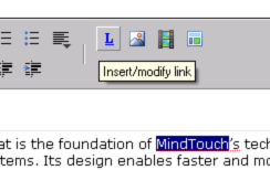
The editor selects text and goes to create a link. The dialog launches:
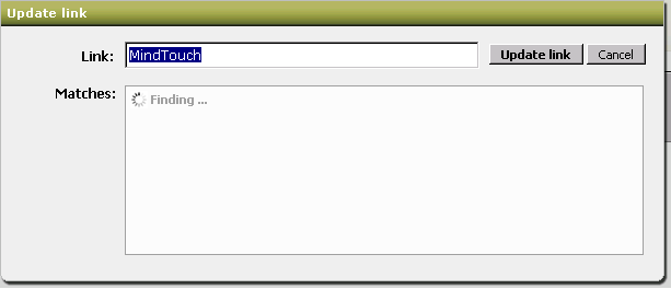
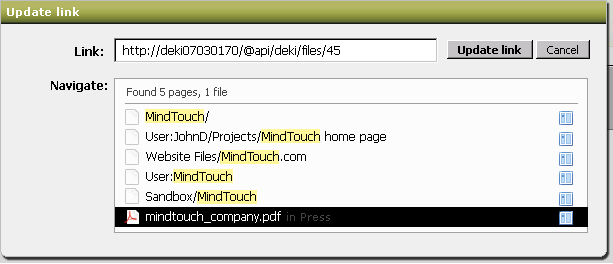
The current link dialog only will search for "MindTouch" as an immediate child of this page, but how often is that actually gonna happen in a hierarchical system? It's much more effective to do a full-site search:
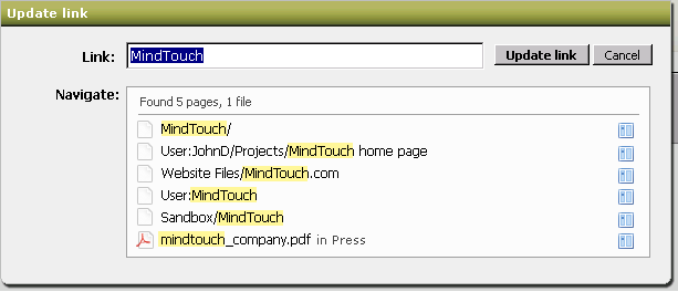
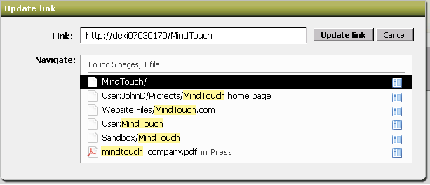
We return all the pages and files that match against this. I'm not sure what the algorithm for the search results will be - Steve thinks alphabetical is best, but I think some sort of sorting based on what the most popular page makes more sense. That way, I can link to the page that has the most views/edits about that particular topic. This assumes that the editor doesn't quite know which page to link to - if they knew, they would navigate the hierarchy to select the page (more on this below). Notice that the pages include full paths, but the files don't (intentional).

One more thing to note is that if you have a hierarchy like this:

  • Foo
    • Bar
    • Baz
    • Bat

It is absolutely useless to return the result sets: Foo, Foo/Bar, Foo/Baz, and Foo/Bat. That's information overload, and at no real palpable gain. Rather than return every page that contains search term "Foo" in its path, we return just the highest part of that hierarchy ("/Foo"). 

The second and third screenshots above show what the selected states look like - the only important thing to note are the URIs that get updated.

Now, let's say that the search term was bunk, and you actually want to link to a child page ... well, if you clear away the search terms, the link dialog switches you to a hierarchy navigation mode: 
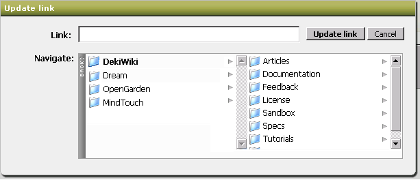
 When I cleared the search term, the dialog immediately showed me where I am in the wiki contextually by using the page that launched the link dialog: the DekiWiki page. DekiWiki has 3 sibling pages, and many child pages. If I wanted to navigate further up the tree, you would hit "Back" and you'd get the parent nodes. To see the effects, check out the AWESOME ColumnNav JS thingie- this is what we'll be using. This is also why "Back" isn't done in the traditional "..." mode that filesystems use - enforcing the left/right metaphors is consistent. (Right = forward, Left = back)

Let's say I click "Articles" on the right column above ... the little thing would swoosh to the left, and I'd see all the pages and files that are in Articles. Note that the URL updates automatically.
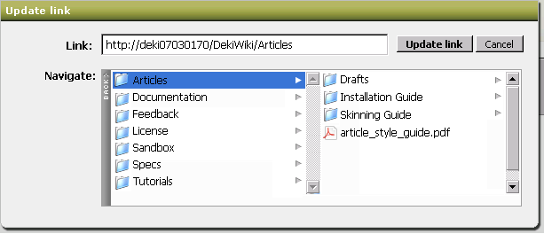
 Creating a new page is easy too; all you do is type in the new page you want into the URL field! The two panes will show the closest parent in the process.

Remember those right icons in the first "search" screenshots I posted above? Those will take you DIRECTLY into hierarchy mode:
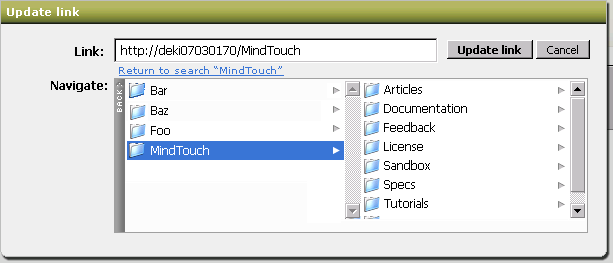
This was the little a-ha moment that Steve and I had today - it's amazingly powerful to take that search result and go into the hierarchy to get more specific. It still maintains the UI rigidity of both screens - we get the power to navigate the hierarchy without mixing the free-form chaos of search.

Now if a search result can lead to the hierarchy view, how can we return back to the search? What if I went into the hierarchy but found it wasn't the right one? It doesn't seem 100% right to me, but I've added text that returns you back to your search result set.

I'll leave you with a final view of the current link dialog now that I've explained some of my thought processes for the new link dialog...


Thoughts? Comments? Questions?  

When I showed this to Aaron, he remarked (and I'm not sure how true this is) that a lot of wiki companies ended up copying our link dialog model (or maybe they copied from Windows XP, too!) ... and I just laughed, cause that design model is just so fundamentally broken. I hope they continue copying that model, cause when (or if ) this dialog gets implemented, it'll blow all the other ones away ...)

Posted by roy on June 22, 2007 at 05:02 PM | 1 Comments

I'm pretty sure the fact that I found this hilariously funny right now means I need to step away from this computer for tonight. 

Posted by roy on June 24, 2007 at 01:34 AM in Ramblings | 2 Comments

Idle thoughts from an idle mind on a Sunday afternoon:

Facebook has reached a peak. F8 is not as cool as I initially thought. I've seen maybe 5 applications added by my friends among all the ones that are available ... I guess there's just a diversity of too many Facebook apps. I don't want to say there's a backlash, but among my friends on Facebook, most of them seem sort of frustrated with the applications. I've also lost the initial enthusiasm I had for developing on the platform - why do all the work when another 4 or 5 companies wil do the same thing (and worst of all, Facebook will emulate if it gets too successful?).

It almost feels like a case where the pundits (bloggers) declared F8 a victory after the press release and all the technologists felt compelled to follow ("everybody else is building on F8, we better, too!"). It doesn't help the technologists that there are clear cases where joining F8 helped (iLive). But iLive was an early partner. How much success will we see from apps written later?

Apple iPhone: meh. My phone's been dying a slow death lately, and I've been looking at replacing it. I took a look at the Nseries from Nokia, particularly the N95 and just wasn't impressed with it. I'm also not completely sold on the iPhone, which makes me wonder if I'm just not ready for a smartphone...

Apple hasn't had a good track record of releasing first-gen hardware w/o some problems: the Cube had the crack defect, Macbook had battery and overheating problems (and that clicking problem), iPod nano had the scratch issue, 3G iPods had the infamous hard disk failure ... I can't imagine the iPhone is going to be perfect. Plus, this artificial deadline of June 29th makes me worry that they're rushing some components of it.

I was trying to decide if I needed to fork over that much money for a data package as well as a $600 phone (I don't have much of an issue with the phone's price tag, but the 2-year contract and the monthly fees on a slow-ass network are deal killers).

I find it funny in all the analysis I read about the iPhone, everyone assumes there's somebody else who will be buying the iPhone.

Is everybody stil enjoying their Nintendo Wii? Has the initial enthusiasm for it worn off yet? How long can swinging your arms to play a video game be fun? It's sorta lame that everytime I get invited to play Wii, we always end up playing Wii Sports. Aren't there any more games?

Posted by roy on June 24, 2007 at 04:12 PM in Ramblings | 5 Comments

So a full version of Kanye West's track "Stronger" (which samples Daft Punk) was leaked on YouTube:

I linked Neeraj to it, which led to this conversation:

Apu1Nahasa: can you explain to me why the "lol" is needed in the following [YouTube] comment: at least daft punk does something brilliant with it lol instead of writing like a third grader
Apu1Nahasa: i feel like lol has replaced the comma in many people's speech online

So true lol so true...

Posted by roy on June 25, 2007 at 02:56 PM in Ramblings, Music | 1 Comments

Ok, two useful things:

If you use Blockbuster's Total Access (the Netflix ripoff), you can get half-off for two months by going to cancel the account - just check the "trying to cut down on expenses" ... when you do, it will offer you half-off for two months. I did this a few days ago, I hope it still works for you!

One of my halogen lamps (300 watts!!!!) burned out last week. I thought it was the perfect time to get it replaced with a CFF-bulbed lamp that I've been reading so much about. CFFs are meant to replace replace your normal incandescent lightbulb, so you can just buy the bulbs and replace any of your lamps. Unfortunately since my old lamp was a halogen lamp, I had to get a new lamp (no problemo!)

I went to Target last week and picked up a 4-pack of the 26-watt CFF bulbs and bought a 2xlight bulb lamp. I was a bit skeptical about how bright two 26-watt bulbs could be ... holy CRAP! This thing is lighting up the WHOLE room by itself (normally I run two halogen lamps to light up the whole room). I plugged in my handy-dandy Kill-A-Watt (that thing is awesome, btw) which is reporting a usage of 46 watts. Compare that to my halogen lamp, which is drawing about 300 watts. My CFF lamp is seven times more efficient than my halogen lamp. This boggles my mind. I'm about to go back to Target this weekend and buy another one of these lamps ...

If you have ANY incandescent bulbs you're still using, I highly suggest you looking into getting a CFF bulb. They're pricier, but you can probably figure out the math on how much money you'll save by switching to it. Plus you get that smugness from "saving the environment."

Posted by roy on June 25, 2007 at 09:36 PM in Ramblings | 1 Comments

Can I go 3 entries with no comments?! Hoo-ah...

Some navel-gazing time. Please skip this entry if you don't like entries which are clearly geared towards inflating my own ego.

One: cool Tabulas blog. It's funny that so many designs on Tabulas are influenced by the crappy initial templates I put up (that's not to say that Poddcorp's design is bad - I think it's rather nice). I mean, sure there are some completely different designs out there, but it seems that a lot of people just modify existing templates, even if they have full access to the HTML templating layer ... did anybody create a gallery of "attractive Tabulas templates" somewhere?

Ok, so I'm not sure who wrote this post on this blog, but I've been referenced:

Just because I like it doesn't mean trackback is going to win, there are problems with it. Roy - the administrator of a large blogging site called Tabulas ) - for example, feels that even if he were to implement it natively on Tabulas that very few users would have the technical savvy to figure out how to use it properly, and most users wouldn't bother with it at all. Roy knows his stuff when it comes to blogging, so perhaps he's not only correct - but also echoing the sentiments of many blogware authors.

WOOO LOOK AT MY EGO GO!!!

Please let it be that I don't know the people who write for that blog. PLLEAAASEEE. It'll be the first indication that I have any sorts of power - that my opinions are read and digested by other people I don't know. That would be friggin' awesome. The POWER! I'm reminded of the Despair.com poster for Power:

Hah, really though. I think this is the first time that somebody I didn't know referenced me. That's friggin' cool. Whoever you are, you rocked my world today. And now, my coworkers will have to pay for it when I walk in like I'm the bomb diggity. MUHAHAHAHA.

ROY'S EGO ... BLASTING OFF INTO SPACE!

Posted by roy on June 26, 2007 at 12:18 AM in Ramblings | 12 Comments

Aaron recently wrote about the need to ban plastic bags and bottles. Although I don't agree with banning plastic bottles (at least they're recycleable!), I do agree that plastic bags are unnecessary. I remember learning in chemistry how much oil (petrochemicals) were involved in the production of plastic, and it was astounding. I've never made the step to consciously cut down on plastic dependence in my life, but it's about time I do!

This bag seems pretty badass - it's made by ACME, and I've always wanted to own something by ACME.

So friends, (lame music starts playing), think about how you can help save the environment. The penguins ... the ones in Antartica ... they need your help. So please, please... stop using plastic when necessary.

Hah, seriously though. Give it a thought and give it a try. If I (selfish, lazy, self-centered, has doubts about certain aspects of global warming) can make an effort, so can you.

Posted by roy on June 26, 2007 at 12:39 AM in Ramblings | 3 Comments

So what's the etiquette when you're waiting for an elevator for a woman? Should you let her in first, which is the standard "holding door open" etiquette (in which case she'd have to hit the buttons), or do you lead the way into the elevator and hit the floor for her?

Posted by roy on June 29, 2007 at 10:08 AM in Ramblings | 4 Comments

CAN I REMIND YOU??? HAVE YOU FORGOTTEN????

iphone iphone iphone iphone iphone iphone iphone iphone iphone iphone iphone iphone iphone iphone iphone iphone iphone iphone iphone iphone iphone iphone iphone iphone iphone iphone iphone iphone iphone iphone iphone iphone iphone iphone iphone iphone iphone iphone iphone iphone iphone iphone iphone iphone iphone iphone iphone iphone iphone iphone iphone iphone iphone iphone iphone iphone iphone iphone iphone iphone iphone iphone iphone iphone iphone iphone iphone iphone iphone iphone iphone iphone iphone iphone iphone iphone iphone iphone iphone iphone iphone iphone iphone iphone iphone iphone iphone iphone iphone iphone iphone iphone iphone iphone iphone iphone iphone iphone iphone iphone iphone iphone iphone iphone iphone iphone iphone iphone iphone iphone iphone iphone iphone iphone iphone iphone iphone iphone iphone iphone iphone iphone iphone iphone iphone iphone iphone iphone iphone iphone iphone iphone iphone iphone iphone iphone iphone iphone iphone iphone iphone iphone iphone iphone iphone iphone iphone iphone iphone iphone iphone iphone iphone iphone iphone iphone iphone iphone iphone iphone iphone

Too bad I don't care.

Posted by roy on June 29, 2007 at 10:40 AM in Ramblings | 1 Comments

It's amazing how well the US Postal system works. On the other hand, IBM Technical Support is not-so-amazing. This is the amazing transcript of my address, taken by an IBM service representative in Atlanta:

Every line, except the country line, has errors. I don't know when I started working for a company called "MineTouch" (it should be MindTouch). I also didn't know my middle name was "Ki" and I had a last name that became with the letter M. Roy Ki Moore? I sound like a bad basketball player (or maybe I'm just associating with Miki Moore...). Notice the concatenation of "Beechst" into one name. Also notice the omission of the suite number (which I'm guessing the security guard downstairs corrected. Also notice the misspelling of "San Diego."

Honestly, I'm really surprised the US Postal Service was able to deliver this to me. Amazing. Simply amazing.

I came into work this morning to this nice little message on my desk, courtesy of Aaron:

Sigh, how true it rings... they all want Roy... 

Posted by roy on June 29, 2007 at 03:07 PM in Ramblings | 2 Comments
« 2007/05 · 2007/07 »