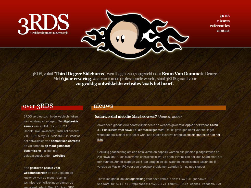
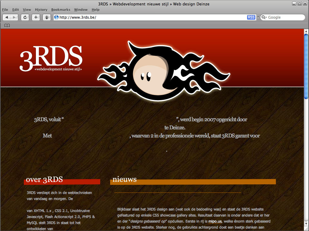
safari, day 2
Doesn't look like Safari renders pages the same on PC as a Mac:
(Images lifted from a blog post and stored on my tabby for archival reasons)


Ruck ro.
. . .
There's been so many blog posts about the font rendering in Safari.
Joel says:
- Apple generally believes that the goal of the algorithm should be to preserve the design of the typeface as much as possible, even at the cost of a little bit of blurriness.
- Microsoft generally believes that the shape of each letter should be hammered into pixel boundaries to prevent blur and improve readability, even at the cost of not being true to the typeface.
If this is the case, I have to disagree with Microsoft's approach to font rendering.
Dave Shea says:
And that’s the difference here. ClearType is a closer match to what I do manually already. Yes, I prefer the way type on OS X looks; ClearType seems too sharp and overly blocky, the subtleties of the curves are lost and it’s overly chunky. But, for the medium in which it’s being rendered, it seems like a more ideal solution.
To me, that could be boiled down to: "I like ClearType cause it does what I do."
But what about for font designers who don't respect the pixel grid? How does that render in ClearType? It seems, if anything, respecting the pixel grid is boxing in font designers to programmatic restrictions. I find that limiting designers to the constraints of a technical systems always lead to some hair-pullling (designers are a finicky bunch).
That "I know better than you" mentality is quite dangerous. Even worse so when that "I" becomes a computer algorithm. (Caveat: I've been struggling with this exact issue trying to figure out how we're going to handle user templating; I can force designers to follow a specific paradigm, or I can give them all the tools to hang themselves)
In any case, I'm not using Safari. I loaded it a few times, didn't find it particularly faster, and I'm not a huge fan of that Apple chrome. The security issues, the lack of consistent rendering ... looks like I'm sticking with FireFox for the time being.
I don't use IE7 regularly because every few weeks I need to switch my IE browser to IE6 for testing purposes for our product. I tried downloading the VM image or IE6 (which does work), but I'm already running our wiki inside a VM on my PC and for some reason that wouldn't play nice with the IE6 VM image from MS.

Comment with Facebook
Want to comment with Tabulas?. Please login.
sal

sal

bert

i don't like IE7 either, even though it takes less resources than FF.