
ui: link dialogs for dekiwiki
(I'm using the new Tabulas entry composer to create this - give it a try when you can!)
The weakest point in MindTouch's DekiWiki is its linking abilities. When I first started using MediaWiki, I marveled at how easy it was to create links. In MediaWiki, you just do this: [[Page To Link To]] which creates: <a xhref="/Page_To_Link_To">Page To Link To</a>.
The simplicity is mind-boggling. You don't even have to worry about linking to a real page - if you link to an important word in MediaWiki and the page doesn't exist, the styling will be distinct, and it will appear as a "Wanted Page."
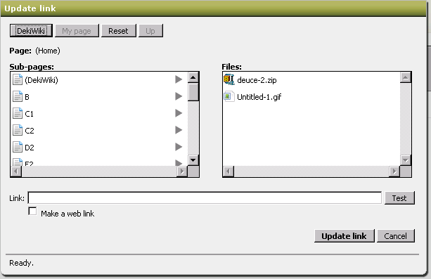
Unfortunately, when we redesigned the original link dialog, I think it was slightly over-engineered - we tried to model our system against popular systems instead of considering our use cases. The current link dialog looks like this:
Hellloooooo Windows XP!
Here are the problems with this design, as I see it:
- The most important element (the link input box) is at the bottom, and lacks any type of visual emphasis. This creates an experience where a new user will load up the link dialog, get confused, and leave never to link again (and that defeats the purpose of a wiki, doesn't it?)
- The reason why this design was implemented was because it reflected the Windows modal dialogs (a stupid idea in retrospect), and because DekiWiki was originally aimed at enterprise usage - in that setting, you can assume there's some "gatekeeper" who is maintaining the hierarchy. If the hierarchy structure is kept consistent, you can assume that users want to discover pages through hierarchy ... unfortunately this metaphor breaks down for large datasets or community-driven wikis.
- Navigation of a wiki via hierarchy isn't as useful as you would think
- Let's think about this for a moment. When I click that "Create link" button after I've selected text in my editor, I either know where I want to link to, or I want to discover where this page exists. Having to navigate a hierarchy to get to the page you think you want to get to is ridiculous (imagine having to click 5 or 6 times to create a link ... how often would you link?
- Too many buttons and input forms
- What's important? What will destroy my state? Why are there two columns with information? Why is there a checkbox that says make external link? What is Test? Basically speaking, the user is asked to make too many decisions at once to perform a simple task.
- Technical issues:
- The dialog used this quirky notation which would allow for relative linking; this meant what appeared in the Link input box was not the actual URL that you want - users couldn't copy that into their clipboard, "Cancel" the link creation, and use that link for something meaningful - what ended up in the Link input box was actually processed once more on the server side.
- Files were linked to an alias in the File: namespace of the wiki and not their absolute URIs. While it poses some advantages (the final location of the file doesn't matter), using the file name as part of the URI causes ALL sorts of problems, especially if the File: was using relative notation (and using a GET parameter to determine the "context" of the file. It is much simpler to use absolute URIs; what's in that link input box should represent the location. Any time any data is exposed to the user, that piece of information should be useful without having to do any special processing.
So, finding myself between work items for MindTouch (we're getting ready to release Hayes Beta 2 next week!), I decided to finally sit down and mock-up the new link dialogs. I have to say now, that I'm really happy with the way these turned out. I slept on it last night and I still felt the same way this morning about the way they'll eventually look (a good sign).
So, the first thing I did was figure out the use cases for the link dialog. These are fairly obvious, but you'd be surprised how often you miss obvious things unless you explicitly state them.
- An editor of a page wants to create a link to a page to create an association between two pages
- They either know the location they want to link to (it's pasted in their clipboard)
- They have no idea where the page is (need to search)
- They have a vague notion of where the page is (it's close in the hierarchy; either a sibling or a child)
I have to take a step back and clarify an assumption: the hierarchy model of DekiWiki means that pages that are in the same hierarchy, whether children, siblings, or parents, have a greater degree of relation than pages outside the immediate hierarchy. This isn't to say that related pages can't exist outside of a hierarchy, but generally speaking, pages in the same hierarchy tend to have a similar subject. This means that the third point indicates that a full navigation of the hierarchy is too much to expect for a casual editor.
MediaWiki handles this problem elegantly by not allowing hierarchies - everything is flat. That means that if I link the word [[intention]], it will point to the title intention, and smart editors will have filled that page with the proper contents (or disambiguate it). Because we allow more granular hierarchies, the problem becomes a bit more difficult, since you can more accurately define a term like: Companies/Apple versus Fruit/Apple versus Record Companies/Apple. Those would be 3 distinct links in our system, but in MediaWiki, you could get away with [[Apple]] and let the disambiguation page deal with it. (Passing off the complexity to the end-user, not a bad thing)
In any case, in keeping with the ease of the bracket notation, I thought it'd be interesting to assume that people want to search first, and navigate later. So, here, in a series of screenshots, is my presentation of how the new link dialog would work.
Step 1: Editor wants to create a link
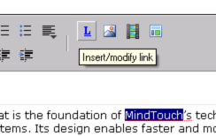
The editor selects text and goes to create a link. The dialog launches:
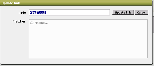
The current link dialog only will search for "MindTouch" as an immediate child of this page, but how often is that actually gonna happen in a hierarchical system? It's much more effective to do a full-site search:
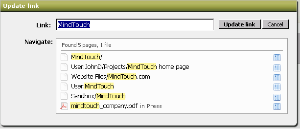
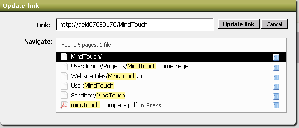
We return all the pages and files that match against this. I'm not sure what the algorithm for the search results will be - Steve thinks alphabetical is best, but I think some sort of sorting based on what the most popular page makes more sense. That way, I can link to the page that has the most views/edits about that particular topic. This assumes that the editor doesn't quite know which page to link to - if they knew, they would navigate the hierarchy to select the page (more on this below). Notice that the pages include full paths, but the files don't (intentional).
One more thing to note is that if you have a hierarchy like this:
- Foo
- Bar
- Baz
- Bat
It is absolutely useless to return the result sets: Foo, Foo/Bar, Foo/Baz, and Foo/Bat. That's information overload, and at no real palpable gain. Rather than return every page that contains search term "Foo" in its path, we return just the highest part of that hierarchy ("/Foo").
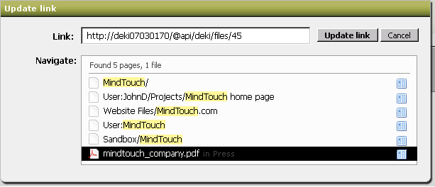
The second and third screenshots above show what the selected states look like - the only important thing to note are the URIs that get updated.
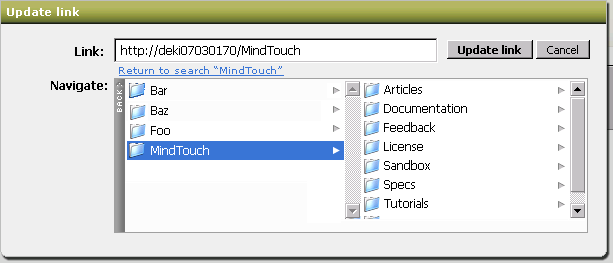
Now, let's say that the search term was bunk, and you actually want to link to a child page ... well, if you clear away the search terms, the link dialog switches you to a hierarchy navigation mode:
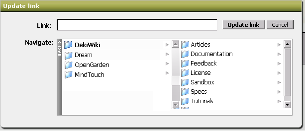
When I cleared the search term, the dialog immediately showed me where I am in the wiki contextually by using the page that launched the link dialog: the DekiWiki page. DekiWiki has 3 sibling pages, and many child pages. If I wanted to navigate further up the tree, you would hit "Back" and you'd get the parent nodes. To see the effects, check out the AWESOME ColumnNav JS thingie- this is what we'll be using. This is also why "Back" isn't done in the traditional "..." mode that filesystems use - enforcing the left/right metaphors is consistent. (Right = forward, Left = back)
Let's say I click "Articles" on the right column above ... the little thing would swoosh to the left, and I'd see all the pages and files that are in Articles. Note that the URL updates automatically.
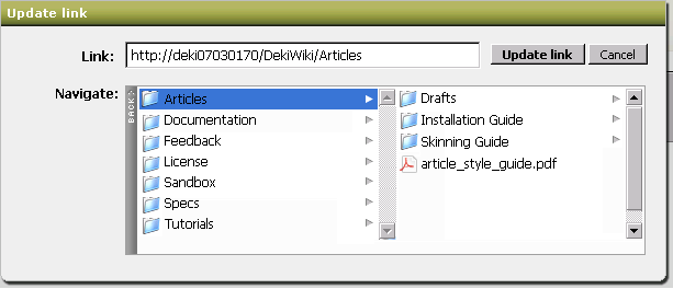
Creating a new page is easy too; all you do is type in the new page you want into the URL field! The two panes will show the closest parent in the process.
Remember those right icons in the first "search" screenshots I posted above? Those will take you DIRECTLY into hierarchy mode:
This was the little a-ha moment that Steve and I had today - it's amazingly powerful to take that search result and go into the hierarchy to get more specific. It still maintains the UI rigidity of both screens - we get the power to navigate the hierarchy without mixing the free-form chaos of search.
Now if a search result can lead to the hierarchy view, how can we return back to the search? What if I went into the hierarchy but found it wasn't the right one? It doesn't seem 100% right to me, but I've added text that returns you back to your search result set.
I'll leave you with a final view of the current link dialog now that I've explained some of my thought processes for the new link dialog...
Thoughts? Comments? Questions?
When I showed this to Aaron, he remarked (and I'm not sure how true this is) that a lot of wiki companies ended up copying our link dialog model (or maybe they copied from Windows XP, too!) ... and I just laughed, cause that design model is just so fundamentally broken. I hope they continue copying that model, cause when (or if  ) this dialog gets implemented, it'll blow all the other ones away ...)
Comment with Facebook
Want to comment with Tabulas?. Please login.