Entries in category "Miyaki"

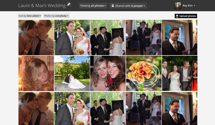
So the last time I wrote, the general direction of miyaki was to implement something like this: 

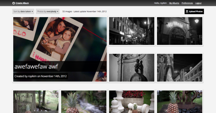
Since then, I've been playing around with some layout changes and it's looking like this so far: (You can see a live demo of it here; use password "password")

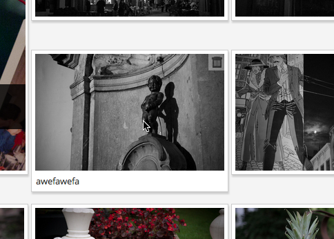
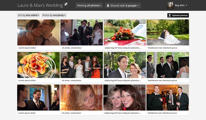
I decided having all the name and icons visible at start would be too distracting from the most important aspect: the photos. So I implemented a hover state on the thumbnails; hovering over them shows the name below it:

I was struggling with the top navigation bar - the more I used the site, the more I was ignoring it - having the title of the album be in the top left didn't feel right. So this updated view reserves the equivalent of 4 photo blocks for the album. I think it helps define the feel of the album right from the start. I've also added rudimentary support for lazyloading thumbnails, but the current transitions need some work (they just drop into place rather jaggedly). 

Deleting images (if you've uploaded any) is a breeze, as is un-deleting them (or completely wiping them from the trash can). 

I've really solidified the user experience for per-image navigation; I'm trying not to use a lightbox (I hate lightboxes), but I'm having some trouble with the single-image views not feeling polished. The goal of this user flow was to minimize the time to contribute to each photo; adding and viewing comments while navigating the images is very, very easy.  

Each single image loads up very quickly via async calls (you can navigate with left/right arrows) and preloads in the background so it feels very responsive. 

Because each image takes up so much screen real estate, I've been playing around with autoscrolling (you'll see when you load each one). I'm not sure this is a good experience, although it's an optimal result. (Feels like you're taking the user out of control of the site). 

Next up: the album editing experience - that's a tricky one. Also, album creation being a smoother part of it... and of course, the most important: sharing options. I'm not completely clear yet how all those pieces will come together right now (part of the reason I moved to this new album view was to provide a better inline editing experience for the album name), but I'll have this weekend to mull over it. 

Posted by roy on November 21, 2012 at 10:44 PM in Miyaki | Add a comment

It's amazing how quickly you can bootstrap projects. I remember when I first build Lightbox7, it took weeks to get it into a testable stage. 

With the toolsets that are available to me, I might have a demoable product within a week. 

Over the past two days, I got individual image views (with easy arrow navigation) as well as the workflow for user login/registrations to view private albums done. 

I started working on the comments data model tonight, but I need to sleep. 

Originally, I wanted collections (curated albums within an album) to be in the v1, but I think I'm going to punt that to a v2. Tomorrow, I'm going to wrap up commenting (editing, deleting), and do a quick blog post on the status for the features I want in a v1 beta test. 

. . .

This project is great, cause it's also giving me ideas on how to revamp Tabulas' featureset. What I may end up doing is just bringing in a simpler version of this codebase into Tabulas! Yay! 

. . .

Been playing around with pricing - I originally was thinking $50/year for 10,000 images... but that seems really expensive. I'm actually leaning towards offering a monthly plan - $4.99/month for 5,000 images after reading this post

And to those of you who help me beta test, free 10,000 image accounts for life! 

Posted by roy on October 25, 2012 at 03:43 AM in Miyaki, Web Development | 1 Comments

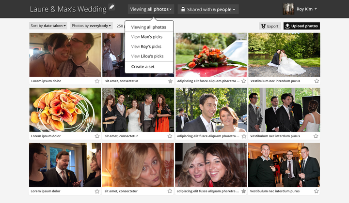
Added some more details to the main listing view, including dropdown views. 

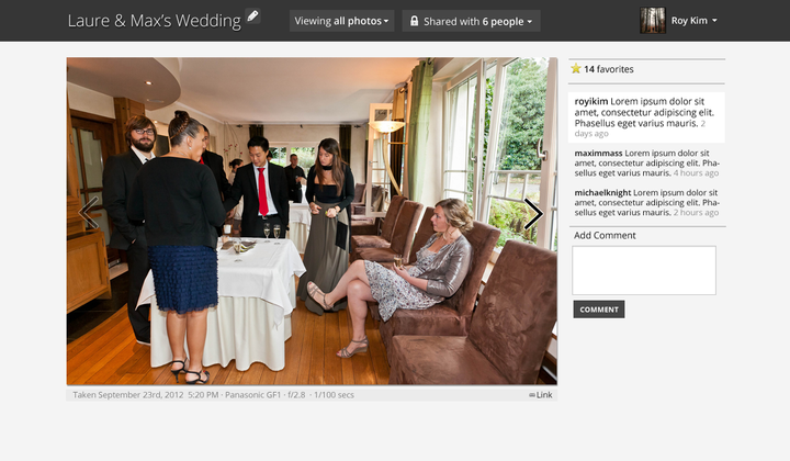
And here's the individual image listing view:

Instead of doing a specific style for the name/description, it's treated as just another comment. This does two things: (1) it reduces a UI element I have to implement, and (2) it makes the comment area always seem populated (well, unless no image is uploaded). The white background comment is the one input by the image uploader. 

Next step will be figuring out the DB schema, which should be trivial since I've already designed like 3 databases for image hosting sites. But when to actually build it? Will need to squeeze in time, I really want to get the Tabulas editor done first (as I'm blogging more, I'm finding this old interface maddening). 

. . .

Besides that, I went in for my Global Entry interview today - I should get my card in the next 7 - 10 business days. This will let me bypass the passport control lines when entering the US in favor of a passport/biometric scanner. Yippee! 

. . .

Also, somebody slashed the top of my car. That's like a $500 replacement - looks like I'm going to find some glue and try to fix it myself. Sigh. Can't complain, overall. Everything is going pretty great lately. 

Posted by roy on October 17, 2012 at 11:57 PM in Projects, Miyaki | Add a comment

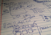
I was slammed with client work today, but I had some time at dinner to sketch out some ideas for miyaki. I had the basic wireframe sketched out with how feature flow would look. 

The goal of the chrome is to minimize draw from the images - long-time followers of my projects shouldn't be surprised. I also want to minimize the amount of texture on the site (gradients, shadows). I won't go completely flat, but I have definitely felt I've been overpushing gradients and shadows lately in some projects. 

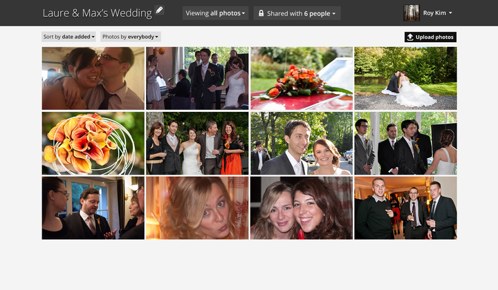
So my first pass followed FB's layout and created square thumbnails of images to create a very grid-y feel:

Looks not so bad. But it seemed so uniform. 

A thought - what if I used the golden ratio for thumbnails? After doing some quick math on spacing and image sizes in a 1000 pixel viewport, I came together with this: 

I really dig the spacing a lot more. Of course, I cheated on these thumbnails by creating the focal points. But I think I can build a quick tool that will let people set the correct thumbnail (ala FB) which will really make the thumbnails pop. 

The next step? Well, captioning is certainly nice: (click image to view larger)

Feeling pretty good about these mockups so far. Only about 3 hours of work! 

Posted by roy on October 16, 2012 at 02:49 AM in Miyaki, Ramblings | Add a comment

It was about 9 years ago when I started Lightbox7, a very early photo-sharing site. I sold it so I could get more cash, but it's always been on my list of "projects to start again when I have time."

Of course, for a long time, Flickr dominated photo sharing, so there was really no reason to kick start another project. Then, FB, Smugmug, (and now Google+) have done a "good-enough" job of photo sharing (actually, G+ is pretty good). But I feel we're at a crossroads again with photo sharing, where a really useful product can be built and supported. 

Here's my idea: an anti-social photo sharing site. Here's the specific use case: 

People who go to shared events (like weddings or Vegas parties) oftentimes want to share photos with other people there. Now, with FB's advanced privacy controls, it's actually pretty hard to do this effectively without friending every person you met. 

This site would allow an event creator to create a shared album. He can either make it a "shared-link album," which grants access to the album to everybody who has the private URL, or will explicitly invite users to the album (via FB friends list). Every album can only be access by registered users (be it via FB or G+ or local registration) and has a max number of users (150 users).  

Every user who can see the album can contribute to it by adding photos, adding comments, or creating a "collection." A collection simply would be a curated view of the album (since it would conceivably hold a lot of photos from lots of users). 

Why do I think this would work?

Try to answer this question right now: "How do I share my photos to somebody w/o FB or Google+ easily?" 

You'd be surprised at the answer: besides SmugMug (which doesn't really approach the social aspect of photos), it's hard to find a solid answer. Everybody requires social logins lately. And a lot of people (like my parents) don't have G+ or FB accounts. 

I've noticed anecdotally that the number of friends who have been sharing photos on FB have been dropping - I actually think FB has gotten ubiquitous enough that it actually feels like a really public space. With this project, you wouldn't worry about figuring out permissions based on your friends - you make the decision on an event-by-event basis. You would have to opt-in every person to your albums. 

The anti-social photosharing site. 

Random Technological/Implementation ideas: 

I really like G+'s approach to a mixed-grid view of images; I definitely think the "unfiltered" view of each album would look like that, and users would create collections by simply clicking images. 

Also, one way to get a leg-up? A Retina-friendly site. Actually, could that be a marketing push all to itself? We'll have to find out. 

There'd be no import features (and exporting only for archival purposes - I'm thinking it'd integrate to Dropbox so you could just select an album to be exported into your Dropbox account). 

Costs are a big problem - Amazon S3 is not very cost effective. I'd imagine at some point I'd end up running my own DC (once I get into a few terabytes, I guess). Glacier looks promising to store the original uploads, and then I'd keep lighter versions on S3 and on the servers as well. 

Pricing:

In keeping with my recent motto to only build for-pay products, I think $49.99/year is a solid price point (or $4.99/month). This would give you a quota of 10,000 images (by my math, each image is about 3MB, so on S3 pricing, that's about $38/year in costs). 

And to solve the "how do you make it social if everybody has to pay?" problem - your usage would be calculated based on the albums you created, so other users would also eat your quota. That also means that not every participating user needs to be a paid member.

In my experience with Tabulas, there were a few members who would actually pay for other members - I think this phenomenom would extend well here - not everybody would want to pay, but those who feel comfortable might end up "paying" for their whole families by being the sole album creator for each event. 

When creating an event/album, you'd set a "target size" for your album (in # of images) - and everybody can upload until that image quota is hit. Other users can donate their # of images to make the album size bigger. 

Name:

In honor of Pinboard.in, my favorite anti-social bookmarketing site, I also adopted the .in domain name extension. When picking a name, I wanted to pick something vague but with some cultural pulls - so I picked miyaki.in. I'm not sure what it means - to me, it sounds like a cool chick who is "over" Facebook but is super artsy with photographs, and thus wants to share them. I don't know. It sounds recognizable and full of character without meaning anything. Just my type of name. 

Unfortunately, my workload is rather full this month, so I'll have to start tackling this slowly (maybe only 1 or 2 hours a day). Fortunately, it's a pretty easy product to build, and most of the UIs are built in my head already (I've been ruminating on a photo sharing site for a while now). 

Posted by roy on October 15, 2012 at 03:34 AM in Miyaki, Ramblings, Web Development | 1 Comments
« Newer · Older »