
miyaki mockups
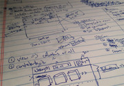
I was slammed with client work today, but I had some time at dinner to sketch out some ideas for miyaki. I had the basic wireframe sketched out with how feature flow would look.
The goal of the chrome is to minimize draw from the images - long-time followers of my projects shouldn't be surprised. I also want to minimize the amount of texture on the site (gradients, shadows). I won't go completely flat, but I have definitely felt I've been overpushing gradients and shadows lately in some projects.
So my first pass followed FB's layout and created square thumbnails of images to create a very grid-y feel:
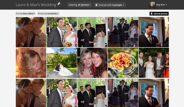
Looks not so bad. But it seemed so uniform.
A thought - what if I used the golden ratio for thumbnails? After doing some quick math on spacing and image sizes in a 1000 pixel viewport, I came together with this:
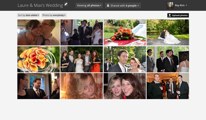
I really dig the spacing a lot more. Of course, I cheated on these thumbnails by creating the focal points. But I think I can build a quick tool that will let people set the correct thumbnail (ala FB) which will really make the thumbnails pop.
The next step? Well, captioning is certainly nice: (click image to view larger)
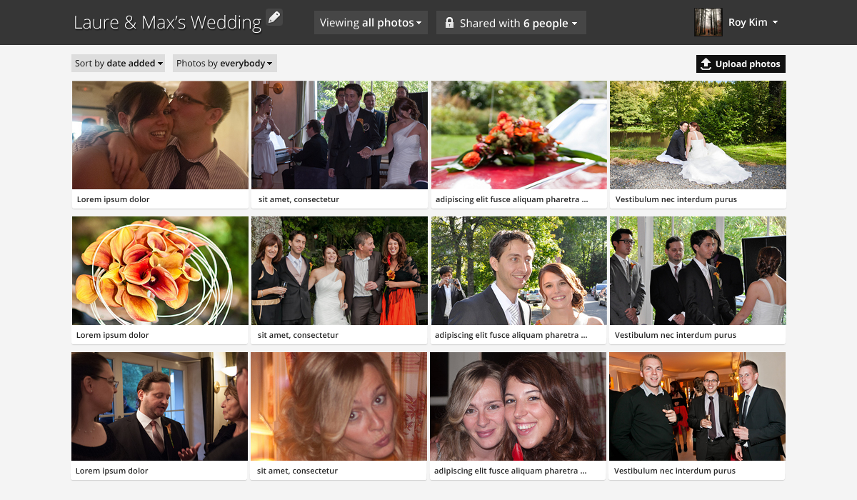
Feeling pretty good about these mockups so far. Only about 3 hours of work!
Comment with Facebook
Want to comment with Tabulas?. Please login.