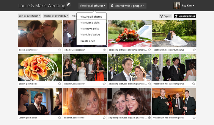
more miyaki mockups
Added some more details to the main listing view, including dropdown views.
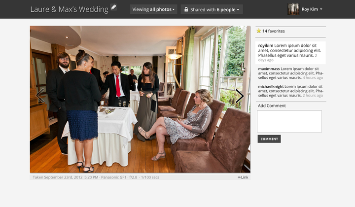
And here's the individual image listing view:
Instead of doing a specific style for the name/description, it's treated as just another comment. This does two things: (1) it reduces a UI element I have to implement, and (2) it makes the comment area always seem populated (well, unless no image is uploaded). The white background comment is the one input by the image uploader.
Next step will be figuring out the DB schema, which should be trivial since I've already designed like 3 databases for image hosting sites. But when to actually build it? Will need to squeeze in time, I really want to get the Tabulas editor done first (as I'm blogging more, I'm finding this old interface maddening).
. . .
Besides that, I went in for my Global Entry interview today - I should get my card in the next 7 - 10 business days. This will let me bypass the passport control lines when entering the US in favor of a passport/biometric scanner. Yippee!
. . .
Also, somebody slashed the top of my car. That's like a $500 replacement - looks like I'm going to find some glue and try to fix it myself. Sigh. Can't complain, overall. Everything is going pretty great lately.


Comment with Facebook
Want to comment with Tabulas?. Please login.