UI tweaks
I love it when you get to the point of a product release where you're cutting things out. The past two weeks, I've been cutting out UI components, features... it's great. Getting rid of the cruft is so much easier when the product is more tangible. Certain ideas just don't make the cut.
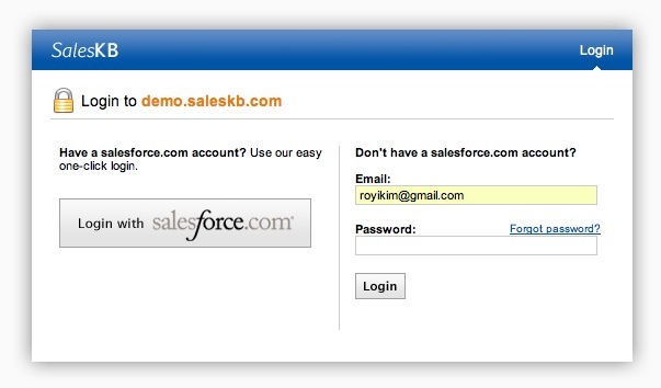
The login screen for the new project was previously:
The text logo was a placeholder. The top right navigation used to have "Create Account" too, but we moved away from a self-registration model once we figured out our user stories. The text also seemed a bit ... constrained.
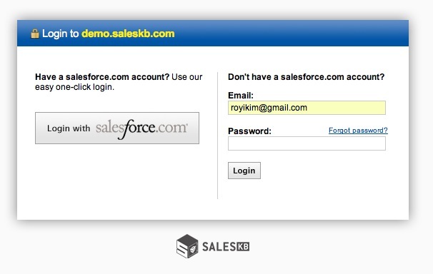
With our new logo, I tried something new:
Collapsed the header text into the header bar saved vertical space. Slightly larger text gave the site more breathing room. But the logo bothered me - seemed too much like a tramp stamp.
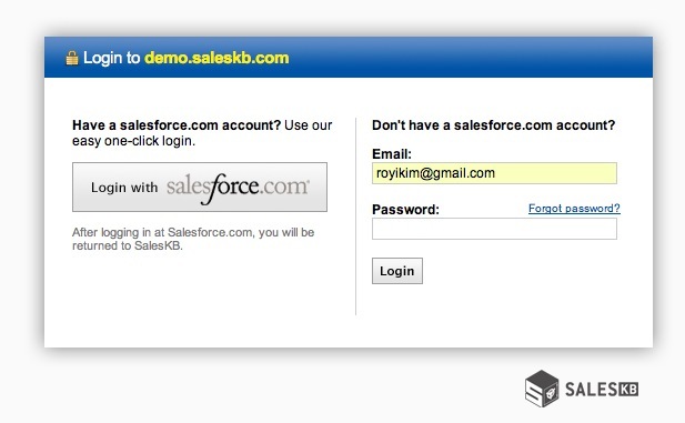
Ahh, nice. Logo still stands out, but isn't the primary focus. I like the left/right balance it gives with the header text.


Comment with Facebook
Want to comment with Tabulas?. Please login.
yuhoo7

roy

but yeah, it's good. you might wanna start off with something cheaper and simpler, like zoho.