
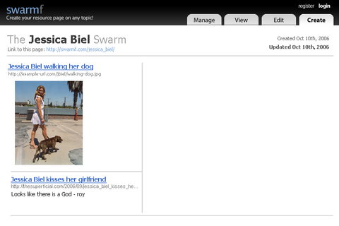
the website look
I threw up a quick page that'll be good enough to for the first launch:
My screenshots tend to be a bit cluttered and disorganized - with my timeline, my mockups tend to be little more than a computerized version of sketches I make. This is enough for me to generate some graphics and to flesh out the details in the markup layer.
I got this design done about 5pm; between dinner, Law and Order SVU, I wrapped up the initial CSS/HTML markup (viewable here). Here's the checklist I ran through to make sure the design was good to go:
- It degrades nicely w/o CSS (I'm trying my best to make this as mobile-accessible from the get-go as possible).
- It works on the PC browsers: Opera, Firefox, and Internet Explorer
- It works when you disable image loading
- Validated CSS and XHTML
As an added bonus, this thing only weighs in at 24K! People from 1998 could use this site ;)
I made extensive use of the image replacement technique and spriting of the rollovers - the tabs are all from one big image, and I use background-position to position them. This works much better than creating each image individually because it cuts down on HTTP requests; for stuff like the logo rollover, you also don't have to wait for the image to load (which is problematic cause it shows the text behind the image).
IE will always b0rk somewhere - in this case, the lack of mix/max-width support (which defines how small/wide a website can be when you drag the browser window around) forced me to create a conditional IE stylesheet to handle that case. I've never been a fan of putting CSS hacks in the master CSS file (for validation reasons, but also because it makes figuring out errors much harder).
Once I'm done with all the work on my PC platform, I'm going to test it and spruce it up a bit for Mac's Safari and Firefox. Now that the design is mostly done, I have to plug it into my existing code and make sure the forms look pretty! Fun times!
Now that I put on my designer/markup hat on for today, it's time I get back into programming ...
One of the issues I've been mulling over today is how to allow authors of swarms to present their data. Like I posted earlier, I really don't want to allow it to look like a blog - I want it to resemble more of a newspaper front-spread. The problem is compounded because I want the design to stretch from 800x600 resolutions to the max width (1024x768). What happens when you have 3 columns @ 250pixels each and you want to embed a 300pixel static item? I think images will be easy to handle - I can add a parser to convert the image to a background image and then cut out the parts that extend beyond the width of a column; videos become tricker (especially ones from YouTube). Videos come in at 450px, which means the column has to be at least 450pixel or everything risks breaking... decisions decisions.
Comment with Facebook
Want to comment with Tabulas?. Please login.