dream car


So, I've finally gotten the new editor up on Tabulas!
You can access it at http://tabulas.com/cp/editor/
Features? Well, it's simplified significantly for the writing experience. The hope is that it encourages more long-form entry writing.
The editor box autoscales to the height of your content, so it reduces the "double scrollbar" problem that's on the current editor.
It also features a drag-and-drop image uploader (and a multi-select image uploader) which should make sharing images much, much easier.
And best - autosave. It will autosave whatever you're writing into drafts so you don't have to worry about explicitly saving! I do need to do some more work to prevent accidental loss (for example, if you load a draft, then start writing a new entry in the same box, it will wipe away the old draft), but it's a great start.
For example, here is a photo of me at Oktoberfest:

And here I am at Max's wedding:
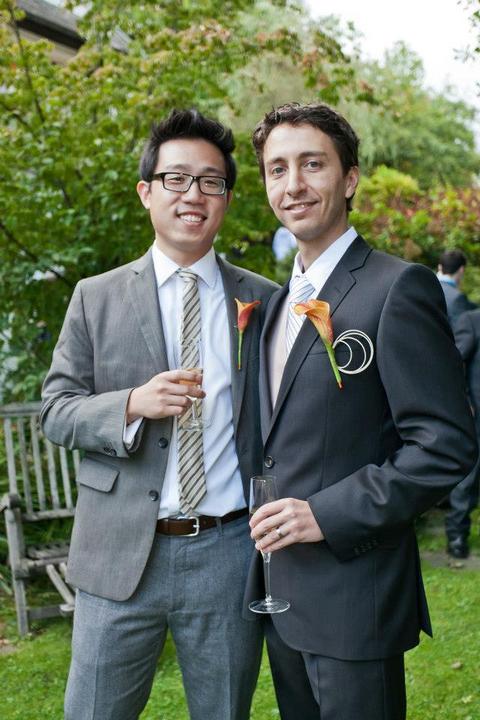
(Sometimes the editor has problems with problems with the heights when images are there - a bug I'll surely nail down).
I'm not requiring this as the default, but I would highly suggest you play with it and help me work out any issues with it - it will become the default soon enough!
And here is a partial screenshot of me authoring this page:
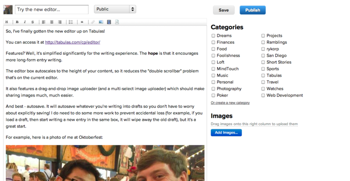
So many people wanted to get into Tabulas, so I opened up registrations for the first time in a few weeks - and what happened? A bunch of spammers came in as well. I wonder if they've had an automated script that just has been running.
Oh well - for the time being, I'm manually checking the registered users and wiping away the spammers. Only have to deal with this problem for one day.
i don't know how 90% of my conversations with people started revolving around me being single, but i'm really getting tired of it. another few close brushes with relationships, but now i'm through. i stayed true so far - no relationships in 2012!
"... up on the hill, across the blue lake... that's where i had my first heartbreak... i still remember how it all changed..."
what a killer song
So the last time I wrote, the general direction of miyaki was to implement something like this:
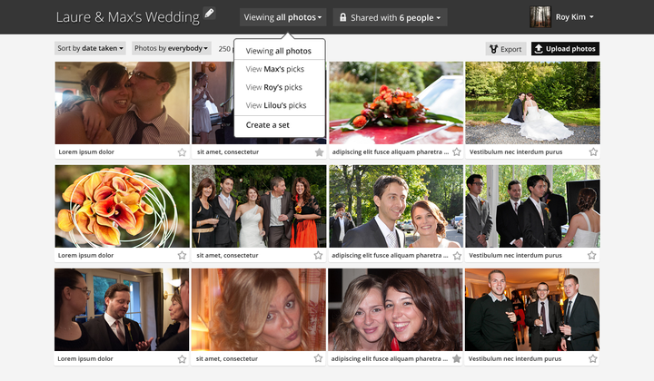
Since then, I've been playing around with some layout changes and it's looking like this so far: (You can see a live demo of it here; use password "password")
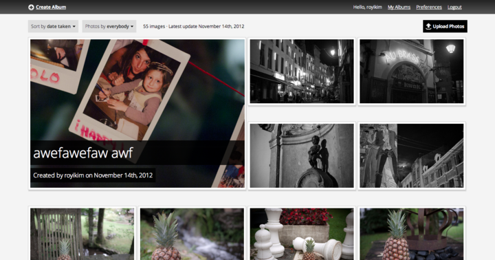
I decided having all the name and icons visible at start would be too distracting from the most important aspect: the photos. So I implemented a hover state on the thumbnails; hovering over them shows the name below it:
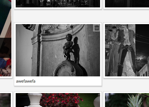
I was struggling with the top navigation bar - the more I used the site, the more I was ignoring it - having the title of the album be in the top left didn't feel right. So this updated view reserves the equivalent of 4 photo blocks for the album. I think it helps define the feel of the album right from the start. I've also added rudimentary support for lazyloading thumbnails, but the current transitions need some work (they just drop into place rather jaggedly).
Deleting images (if you've uploaded any) is a breeze, as is un-deleting them (or completely wiping them from the trash can).
I've really solidified the user experience for per-image navigation; I'm trying not to use a lightbox (I hate lightboxes), but I'm having some trouble with the single-image views not feeling polished. The goal of this user flow was to minimize the time to contribute to each photo; adding and viewing comments while navigating the images is very, very easy.
Each single image loads up very quickly via async calls (you can navigate with left/right arrows) and preloads in the background so it feels very responsive.
Because each image takes up so much screen real estate, I've been playing around with autoscrolling (you'll see when you load each one). I'm not sure this is a good experience, although it's an optimal result. (Feels like you're taking the user out of control of the site).
Next up: the album editing experience - that's a tricky one. Also, album creation being a smoother part of it... and of course, the most important: sharing options. I'm not completely clear yet how all those pieces will come together right now (part of the reason I moved to this new album view was to provide a better inline editing experience for the album name), but I'll have this weekend to mull over it.