Image sharing
Facebook recently changed their photo feature, and the evolution to their UI has been interesting.
In the beginning, you could only upload images into albums - there was no way of avoiding the mental process of classifying your images. Since then, they've simplified the mental model for uploading images - for mobile, they get classified into the mobile folder. There's no way to reclassify images.
It's interesting - it's as if Facebook doesn't even want the concept of albums to exist. This does make sense from the mobile perspective, since you rarely upload many images from your phone at once (which would require an album-based classification mechanism).
I'll be honest - the flat images (no albums) is really appealing in terms of its development. Creating hierarchical albums is a pain in the ass to code for, especially when you take into account permissioning (albums in Tabulas do not inherit, so problem slightly averted).
I would be interested in removing albums altogether from Tabulas, except some are classified by users already. So I'll have to keep them.
But it's interesting what FB has done - albums are essentially hard to discover on their own. From the new profiles, the default photo view is photos you're tagged with. After that - it's photos - all of them. Then you have albums. Furthermore, albums aren't very visually distinguished from photos, which confuses me all the time.
I'm not sure what implifications this has for Tabulas quite yet - I can't abandon albums altogether, but I might move more towards a stream-based view of photos. Albums are only really useful for (1) permissioning or (2) presenting a story around photos. And in the case of (2), I feel strongly that the storytelling experience around photos should be done through entries.
Which lead me to a nice 10-hour hacking fest on the plane ride over where I played around with cleaning up the image uploading experience for Tabulas through the new editor. The new editor will support multiple-file uploads as well as drag-and-drop. The next hard step is figuring out how those images get embedded into the editor.
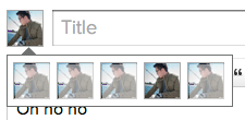
And Narzack - already took your notes into account. Multiple usericons will be supported in the new editor. It actually looks better with it - instead of the dropdown, we use the usericons themselves (I was too lazy to use different usericons - but each of those icons in the 2nd row should be different):
Other features TBD.


Comment with Facebook
Want to comment with Tabulas?. Please login.
Narzack
