
design phases of tabulas
Tabulas's control panel has gone through three distinct phases of development. (I'll use the category UI for consistency) You can click each image to get a full-sized image.
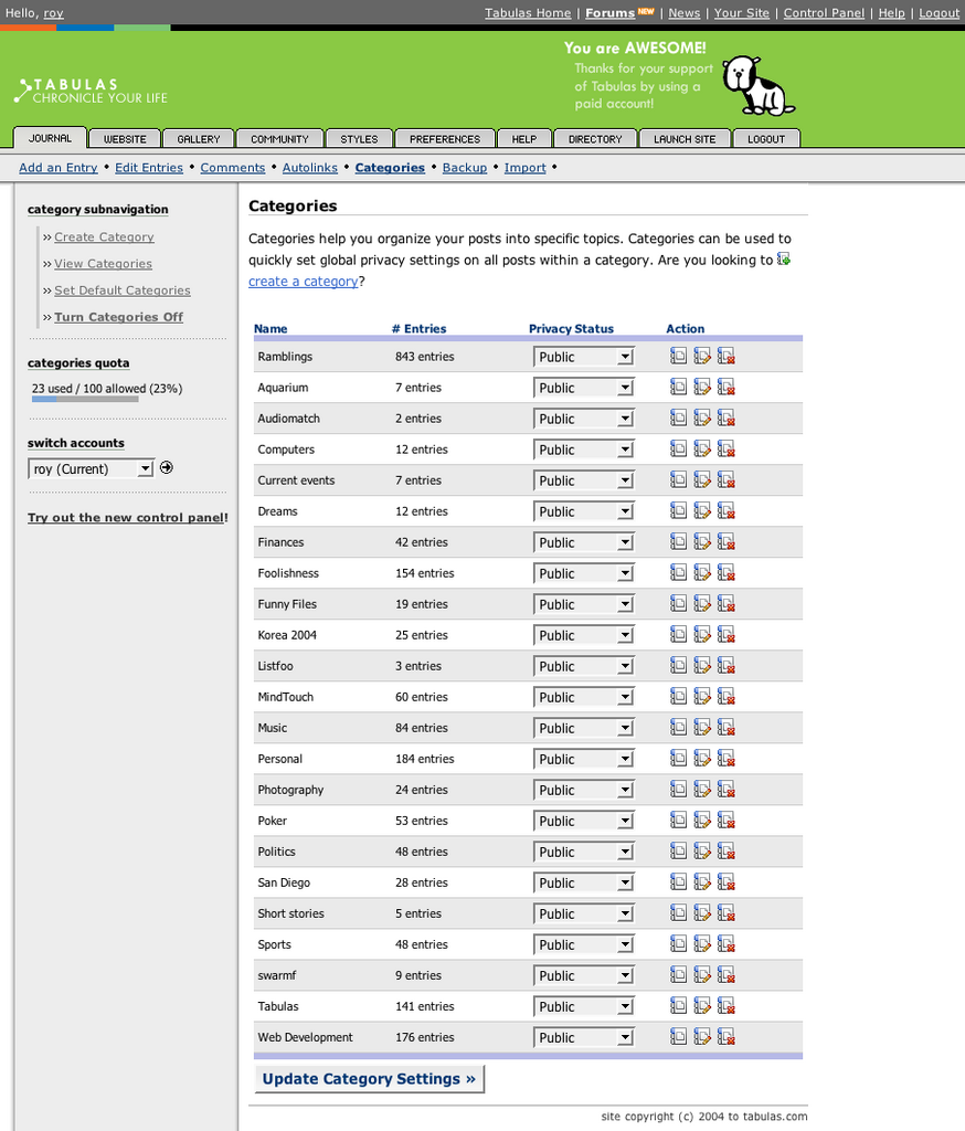
Phase one: The original (1.0)
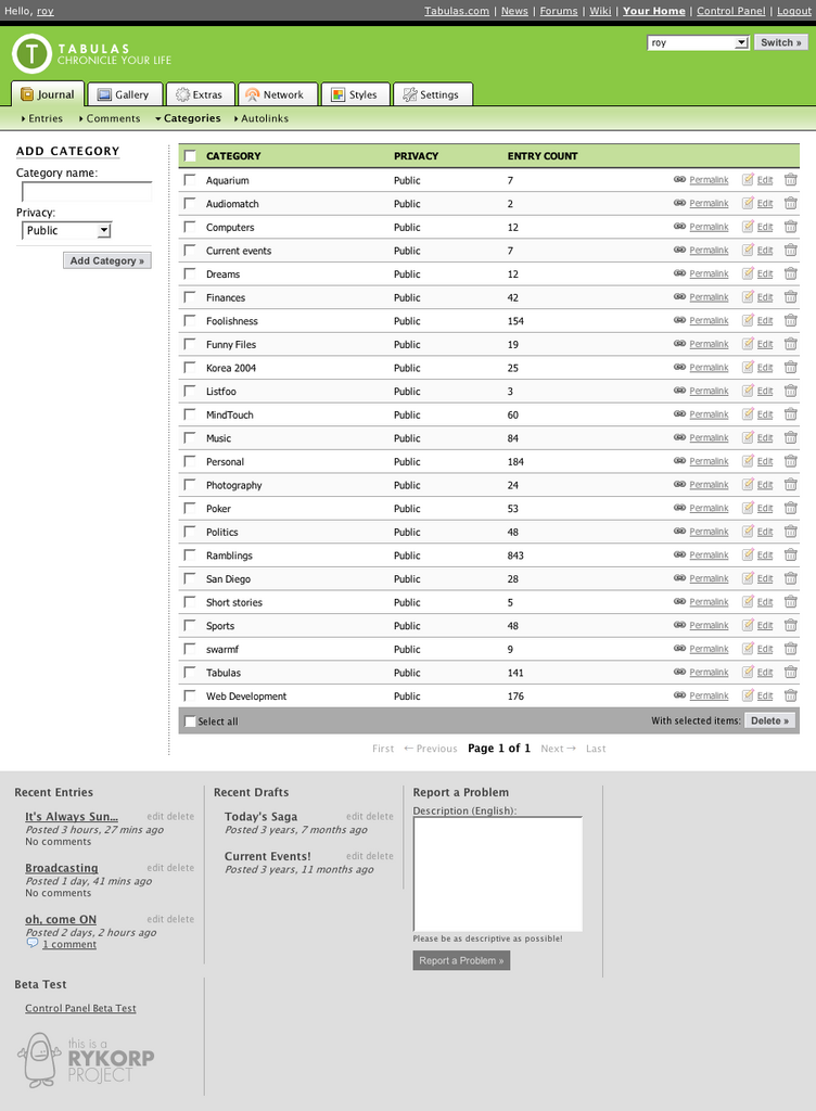
Phase Two: The failed "new" control panel (2.0)

Phase Three: The "non-crappy" new one (2.5)
Why the original version sucked
Simply put, I was more interested in learning about PHP than designing a nice user interface when I first launched Tabulas. Features were added ad-hoc without much though into how they should be organized. This manifests itself through the cluttered (and unorganized tabs): there are 10 first-level tabs (and most of them don't even make sense - logout is an action ... it's a tab... really?). The 2nd-level organization doesn't even make sense: I put "Add entry" with equal weighting to "Entries", while everything else got only one treatment (there were no "Add categories", but just "Categories").
The 3rd-level operations (like "Add Category") were situated along the left side. This became slightly problematic when the left navigation became inconsistent; some pages would have left navigations, while others didn't. While this isn't so bad in itself, having to figure out if there are more actions available on every page was unnecessary cognitive load.
Furthermore, there was no way to quickly manage multiple categories. There should be a way to manage multiple categories at once. (Realizing this, I hacked in multiple <SELECT> boxes, which just made the page look god-awful).
Why the "failed" version sucked
I cut down the first-level tabs to 7 tabs. However, the 3rd-level operations are buried (Can you quickly locate "Add category"?). I was going through a "right hand navigations are awesome!" phase at the time, but I failed to realize that right hand navigations should supplement the primary content. Most people hit the "Categories" option trying to "Add a category" and had their eyes immediately drawn to their list of categories first, since we read left-to-right. FAIL. Nothing important should ever be in the right column.
Not only that, but I was using a table-based layout without any of the benefits. It's impossible to scan the "failed" version to see what's the most popular category quickly.
One of the benefits if multi-deleting became possible, using the checkboxes and the "Delete categories" option.
Why the new version sucks a lot less
7 tabs becomes 6 tabs. I don't mix actions with items on the 2nd-level navigation; instead of:
"Create entry (action) | Entries (items) | Categories (items) | Comments (items) | Autolinks (items) | Backup (action)"
I have all items:
Entries | Comments | Categories | Autolinks
The 3rd-level navigation is included on the page itself; no need to launch a new page to add a category - you just add it from the left! One thing that's not obvious from this page is that the other third-level options expand right underneath the 2nd-level navigation if they exist, as made obvious from this "Entries" view:
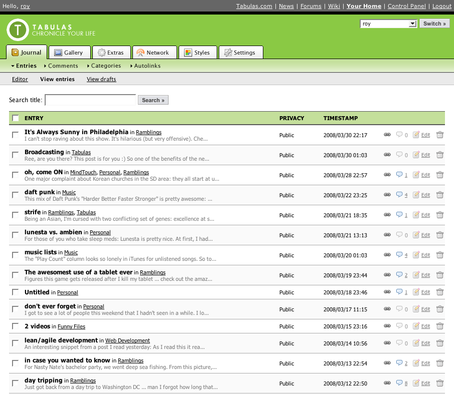
(the 3rd level will be converted to all actions that relate to "Entries")
I've also removed the right-side navigation, to bring focus to the actions available to you most immediately (that's the whole F-shaped pattern at work). I'm also experimenting with the latest design craze: vertical separation of content. So far, I'm hating having to scroll down to edit my most recent entry ... we'll see.
. . .
Edit: In celebration of fixed crossposting, I'm crossposting all my entries to my new LiveJournal account, as well as my new Wordpress account. When (not if  ) Tabulas goes down in flames due to my incompetence, I'll have backups all over the place!
I also fixed the emoticons for the new editor today, can you tell?

Comment with Facebook
Want to comment with Tabulas?. Please login.
chaseafterwind

jihwan
Cheryl_Ann

roy
