microsoft
There's always been something very ... amateruish about Microsoft's web properties. Even today, something about bing.com's homepage bugs me - the logo reminds me of those times when I hook up my laptop to a project for a presentation, and the projector only projects at some ridiculous resolution which distorts my screen. Or when people insist on watching 4:3 aspect ratio television shows on HD TVs without switching the ratio accordingly (just because you have that real estate doesn't mean you need to use all of it)
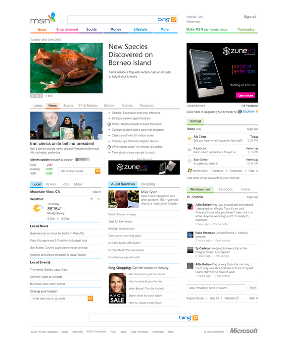
Anyways, the new MSN.com homepage was the first MSFT property I saw and said: "Wow, they're really getting their shit together."
Check it:

Beautiful use of white space - incredibly content heavy, but doesn't feel like it. Great use of accent lines (I'm a sucker for that style). Fantastically clean ... wonderful use of grid design!
And the logo is even passable for me! (It still feels a bit far to streeeetttched for me)

Comment with Facebook
Want to comment with Tabulas?. Please login.
spaceinthewho
