
oh god, not this feeling again
A complete and utter feeling of despair. The new control panel is an utter piece of crap. Sigh.
Sorry, everybody :( Back to square one...
Edit: Some thoughts I should write down so I don't forget:
You know how you get so invested in something you can't look at something objectively? Yeah, I just got over that period with the new control panel last week. So I'm trashing the whole thing, design and all coding (the code for other reasons) and starting from scratch ... again. Lovely. Given that this is my third (or fourth) try, hopefully I'll fare better this time around.
The right column = bad idea. I initially shifted the items to the right side to take advantage of the "F" viewing patterns of most visitors. The "F" viewing pattern indicates how most people will scan a new webpage - first along the top, then down the left side, and then the top of your content area. For example, if you were track where the eyeballs were focusing on when you loaded the old control panel, it'd most likely look something like this:
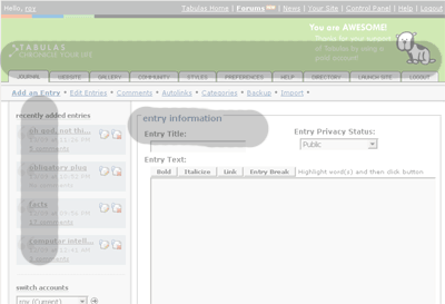
For the new control panel, I shifted things right (believing, incorrectly, that focus on the content was more important - wrong!):
The problem is that the right side became ignored, and I idiotically decided to put the tertiary navigation there:
The numbers indicate where options are located. Talk about bad design.
. . .
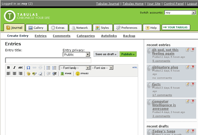
Given the vast number of features Tabulas has, I've concluded that there's really no way to avoid 3 depths of navigation.
I detest drop-down menus (I hate forcing users to discover navigation), so those were out of the questions. One of the few things I was happy about the new control panel is the reorganization of tabbed items and the secondary navigation - it was just a matter of where to place the third level nav elements.
So after a bit of mucking around (the following image took me all of Saturday - can you believe it?), I've reached this conclusion:
The third level of navigation appears right below the other navigation items (jeez, that might be making too sense - it only took me 2 years to realize this!!!!!!!!!). I also removed the "help" tab, changed the "Preferences" tab to "Settings" (less geeky, and shorter) and switched up a few icons (I'll prob change the "Extras" icon back, since the wrench is way too similar to that of "Settings"). Yay, down to six tabs from ten tabs (currently control panel). Less visual overload = win!
All navigation elements will be horizontal - but the implication of this is that I'll be removing the vertical left navigation. The left nav's been served a lot of utility on the old control panel, cause it was a way of quickly finding your recent entries - so the downside of this will be that the "recent entries" box will have to be removed.
But now, I'm debating the merits of a "dashboard" view which would be loaded by default instead of the "add entry" view upon login - the dashboard view would have: your recent entries/images/links/blah, recently added friends, your community activities, and your friends' recent activities. The problem is, i'm really reluctant to add another tab just for a dashboard interface - I worked really hard to pare down the number of tabs to six ... ho hum.
yuhoo7

simonkayar

karcyr

bert

i detest you.
come to vegas =)
monkeyone

roy

karcyr

AaronF (guest)

Comment with Facebook
Want to comment with Tabulas?. Please login.
hapy